 Muzammal Shahzad
Let’s create a responsive layout in SwiftUI that adapts gracefully to different screen sizes using conditional stacks (like Group and HStack or VStack) combined with GeometryReader:
import SwiftUI

struct ResponsiveLayoutView: View {
    @Environment(\.horizontalSizeClass) var sizeClass

    var body: some View {
        GeometryReader { geometry in // Get screen dimensions
            if sizeClass == .compact { // Smaller screens (e.g., portrait)
                VStack {
                    VStack { // Content Section 1
                        Text("Section 1")
                            .font(.title)
                        Image(systemName: "house.fill")
                            .font(.system(size: 80))
                            .padding()
                    }

                    VStack { // Content Section 2
                        Text("Section 2")
                            .font(.title)
                        List { // Example list
                            ForEach(1..<6) { index in
                                Text("Item \(index)")
                                    .contextMenu {
                                        Button(action: {
                                            // Edit action
                                            print("Edit item \(index)")
                                        }) {
                                            Text("Edit")
                                            Image(systemName: "pencil")
                                        }
                                        Button(action: {
                                            // Update action
                                            print("Update item \(index)")
                                        }) {
                                            Text("Update")
                                            Image(systemName: "arrow.up.circle")
                                        }
                                        Button(action: {
                                            // Delete action
                                            print("Delete item \(index)")
                                        }) {
                                            Text("Delete")
                                            Image(systemName: "trash")
                                        }
                                    }
                            }
                        }
                    }
                }
            } else { // Larger screens (e.g., landscape)
                HStack {
                    VStack { // Content Section 1
                        Text("Section 1")
                            .font(.title)
                        Image(systemName: "house.fill")
                            .font(.system(size: 80))
                            .padding()
                    }
                    .frame(width: 200)

                    VStack { // Content Section 2
                        Text("Section 2")
                            .font(.title)
                        List { // Example list
                            ForEach(1..<6) { index in
                                Text("Item \(index)")
                                    .contextMenu {
                                        Button(action: {
                                            // Edit action
                                            print("Edit item \(index)")
                                        }) {
                                            Text("Edit")
                                            Image(systemName: "pencil")
                                        }
                                        Button(action: {
                                            // Update action
                                            print("Update item \(index)")
                                        }) {
                                            Text("Update")
                                            Image(systemName: "arrow.up.circle")
                                        }
                                        Button(action: {
                                            // Delete action
                                            print("Delete item \(index)")
                                        }) {
                                            Text("Delete")
                                            Image(systemName: "trash")
                                        }
                                    }
                            }
                        }
                    }
                }
            }
        }
    }
}

struct ResponsiveLayoutView_Previews: PreviewProvider {
    static var previews: some View {
        ResponsiveLayoutView()
    }
}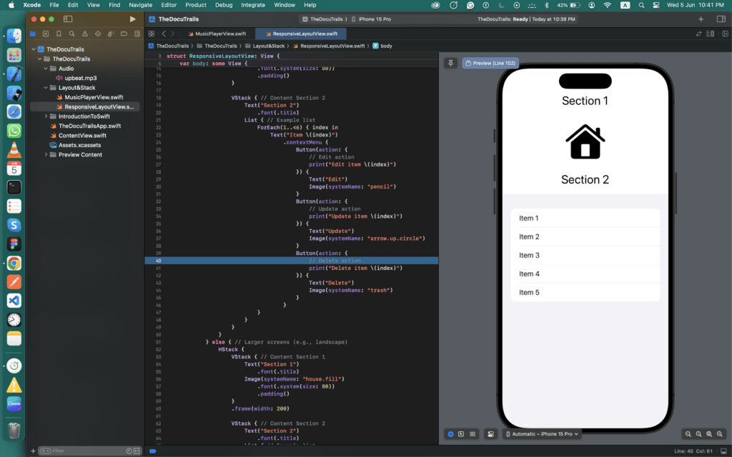
Breakdown:
- Imports and Environment:
import SwiftUI: Imports the SwiftUI framework.@Environment(\.horizontalSizeClass) var sizeClass: Retrieves the horizontal size class of the environment.
- Body Declaration (
bodycomputed property):GeometryReader: Retrieves the screen dimensions and adjusts layout based on size class.if sizeClass == .compact: Checks if the device is in a compact horizontal size class (e.g., portrait orientation).- VStack: Vertical stack layout for compact size class.
- VStack – Content Section 1:
- Displays “Section 1” with a title font.
- Shows a house icon using
Image(systemName:).
- VStack – Content Section 2:
- Displays “Section 2” with a title font.
- Uses a
Listwith 5 items (“Item 1” to “Item 5”). - Each item in the list has a
contextMenuwith Edit, Update, and Delete buttons.
- VStack – Content Section 1:
- VStack: Vertical stack layout for compact size class.
else: For larger screens (e.g., landscape orientation).- HStack: Horizontal stack layout for larger size class.
- VStack – Content Section 1:
- Displays “Section 1” with a title font.
- Shows a house icon using
Image(systemName:). - Constrained to a width of 200 points.
- VStack – Content Section 2:
- Displays “Section 2” with a title font.
- Uses a
Listwith 5 items (“Item 1” to “Item 5”). - Each item in the list has a
contextMenuwith Edit, Update, and Delete buttons.
- VStack – Content Section 1:
- HStack: Horizontal stack layout for larger size class.
Preview:
#Preview {
    ResponsiveLayoutView()
}
Provides a preview of the ResponsiveLayoutView with sample data.